
The Supply Store
Back to YouCanDraw .Com
Part III: Cross-Hatching |
Cross-hatching demo
So how do you represent those different tones and values? One way many artists and caricaturists add tones to their drawings is by rubbing into the pencil - smearing the pencil with a fingertip or gloved finger. Another quick method is by cross-hatching. We'll look at cross-hatching first. It's not as fast as smearing but you can get almost as fast. Cross-hatching is a learned skill, a technical skill. It's one of the few skills that really rests on technique. All art depends on technique at some level but cross-hatching is something you get good at and can get good at fast in just a few dozen short practice sessions.
Mini-directory of this page Doodle
Practice I |
When I first started...
When I first started using pen, I had to teach myself how to cross-hatch. It's not a natural occurring skill anymore than brushing your teeth was - but like brushing your teeth it's just as learnable (and actually is a very similar action.) Smearing was a piece of cake in comparison because you just dive in there like a kid into his finger-painting. In the beginning my cross-hatching lines were shaky, uptight, uneven, not even parallel 5% of the time. So what did I do? Had fun with it! I took out a piece of paper, found a Gerry Gersten caricature from an old Quality Paperback Book Club ad ( I think it was the "Sun still Rises" guy - Earnest Hemingway. Blew it up in a copy machine and copied small sections at a time. Then I stretched out on my own. (Big stretch, huh? )
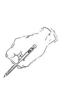
Hold the pencil away from the tip
Getting started
How do you do it? Start simple, start small. Get a piece of paper and fill an area of say 2 inches by 2 inches. Fill it with short parallel lines (hatches). Use a pencil or pen - it doesn't matter. Hold the pencil about a third of the way up from the tip. This way you'll get a little more "swing weight": which gives you more motion out of the tip and a much smoother line. Not to mention with an economy of wrist action too. You can set down the lines with a rapid "flick of the wrist", or you can go slow. You can move your hand in an outside-moving-in motion, (like in the animation above) or in the opposite direction - an inside-moving-out direction.
Following are three exercises. I call them "doodle" exercises since you can practice hatching the next time you're on hold - when you'd normally be doodling in your phone book while you wait. Take the same opportunity to practice your hatching.
Doodle
practice I
(hatching practice )
(to top)
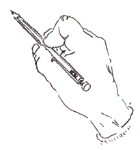
Use a grocery bag, a brown bag, an old envelope, - it doesn't matter just get something to write on. If you got a notebook you use all the better - you can document your fast progress. Grip the pencil up farther up from the tip than you normally do. On your paper make a series of parallel lines like you see in this picture:
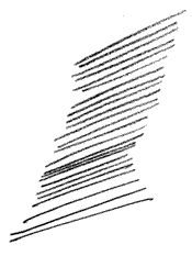
A patch or "set" of
hatch marks
(back
down to doodle practice II)
The number of lines isn't important, just get your hand moving. You can move your pencil with a bend from the wrist or you can make the motion solely with a curl of the fingertips - finger flexing - the same way you'd cross a "t" except you'll be working larger and longer. Some people say use only a flick of the wrist. I say use whatever works for you. (I use both - the wrist flick for quicker, straighter lines, the finger bending/curling method for tight spaces.
Experiment
Again, experimentation is the best way to find out what works best. And to experiment you have to draw, so grab you paper and pencil and start! :-) I'm left-handed and I've found starting at the right and moving left works best for me. I alternate between both the "flick" from the wrist and the finger-flexing methods.
Finger-flexing is just like it sounds.(start by crossing your own hand written letter "T" about 20 times - as if you were building a mast on a boat.) Which I use depends on what's required by the job. It takes some practice deciding which, but like everything else, it'll come if you put in the effort, (where have you heard that before?).
Add direction
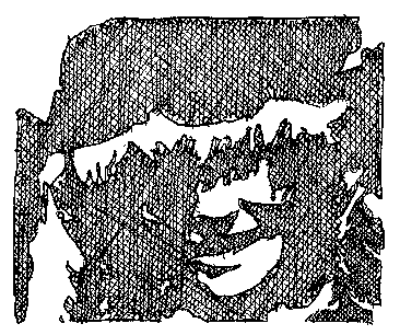
When you get to drawing pictures or recognizable shapes, you can add direction to the shapes like you see in this next picture. By direction I mean you can mimic with hatches the plane that part of the face you're drawing is headed. That was confusing. Look, for example, in the following illustration. The cheek and jaw extend through the space from ear to lips, right? So the "plane" that part of the anatomy occupies runs from ear to chin: so you draw the hatches in a direction from ear to chin. (You don't have to do this, it just accentuates the length of the jaw - if that's you're intention in the picture.) Drawing lines perpendicular over the directional lines you just drew also increases three-dimensionality. Try to find perpendicular or nearly perpendicular lines in the next picture. Observe other drawings for hatching and you'll get a feel for "directionality" in the cross-hatching.
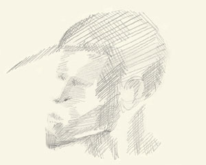
Suggesting a face with just
cross-hatching
(go back down to
"tone")
The purpose of "Lesson 9: Light and Shadow" is to get you perceiving and recording shadow and light as shapes. When done accurately your renderings will represent shapes and volumes. And by varying the density of hatches, you can achieve varying values of tone. (You saw tone and value mentioned in the introduction of this section.)
Note the different layers of
hatch sets
Doodle practice II
Cross-hatching exercise
(to top)
Exercise number two: add cross hatching to your next set of hatches. Take five more minutes. And after you've drawn about ten to twelve sets of hatches like like you saw in the first illustration above, you're ready for your first set of cross-hatches, like this:
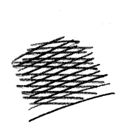 |
Draw a set of hatches just like you did above. After you've drawn half a dozen hatches, draw a second layer right over them. It's ok to slightly rotate your paper to get a smooth stroke - keep practicing and you'll find you can draw parallel, confident hatches from all sorts of angles. There's a beauty in cross- hatching - it's the pattern that pops up within the pattern that you see.. |
The illusion in cross-hatching. Cross-hatching conjures up an illusion of motion that's not in any one of the elements of hatching. The motion's not in the individual lines but rather is a result of an interaction phenomenon the lines cause in the mind of the observer. Physicists call it a "light interference pattern" or "resonance". Artist's call it a "moiré" pattern. By whichever name you call it, or whatever the true cause of it is, the effect can be very pleasing to the eye.
At what angle do you draw the cross-hatches? That's something you'll get a feel for over time. I generally try to criss-cross them at less than right angles, (you know, less than 90 degrees). No one's going to bring out a protractor, but I'll venture the average cross-hatch is somewhere between 15 and 40 degrees. Like I mentioned above, perpendicular lines work great for bringing out intersections of planes, and for adding three-dimensionality - "boxiness" if you will.
Do you have to always keep them within those parameters? Of course not. In fact, when you want to really pile up the shadowing, make it really dark or even black, you can draw the cross-hatches at as many different angles as you like - as many different angles as spokes angle on a bicycle wheel. Look at some of the pictures at the bottom of this page below. They're close-up shots of different sections of cross-hatched caricatures. Note that some of the lines hook at the ends. Some are almost perfectly straight. Your signature cross-hatches will appear after you practice them for a while.
Doodle
practice III
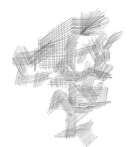
try this random cross-hatch exercise
(to top)
Squint and look for different shades of gray
In this third hatching exercise, try building a random piece of abstract art out of nothing but overlapping sets of hatches and cross-hatches. There was no intention to make the above illustration look like anything. (If there was, it was unconscious or began to appear only after the picture developed.) So go crazy with this one. Give it a full 15 to 20 minutes. The sole purpose is to link your wrist and hand and brain muscles into a coordinated line-making machine. (It's one of the few "brainless" activities you'll get to do in this program. Have fun with it. Do it often. : -)
Values of tone and cross-hatching
In this last section on cross-hatching, you'll take a look at getting varieties of value: from black to white and everything in-between. And it's actually quite simple. You saw the effect layering different sets of cross-hatching had on the density of shadow above. It's built around this simple idea: the more hatches, the more dense the color. If you're using black ink, the greater number of layers you use, the darker your picture becomes. The second element: line spacing. (to top)
Line spacing
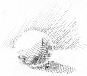
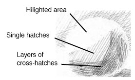
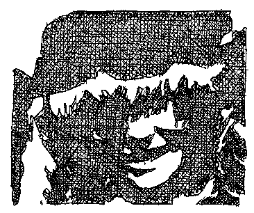
At a distance, the lighter, more widely spaced hatch sets appear as very light grays or even as reflected light by being lighter in tone than the surrounding heavier shadows. That's pretty self-evident, isn't it? Look at the sphere below. Find the highlighted area. Now move your eye down from the plain white area to the single hatched area. That is, to the area with hatches going in just one direction.
This first level of shadow below the highlighted area looks like a light shadow in contrast to the highlight. The hatches are slightly wider apart in comparison to the more densely packed hatching in the deepest shadow area. If you look at the picture long enough, this same single-hatched area starts looking like reflected light in contrast to the deeper shadows underneath it. There's a certain amount of relativity to it. For a more dramatic example of spacing, look at the mini-portrait above. (There's a link there to bring you right back down.)
Producing density with layers
Point: the point here is that you can vary both the distance between individual lines within hatch sets as well as the number of layer s of hatches to get different density tones.
Now let's combine what you did in part II of Lesson 9 with this cross-hatching section. In Part II: Your first shadow exercise, you worked at recognizing shaded areas as shapes. You colored them in with a solid black marker or you painted them in with India ink or black water color, (something like that). In this exercise, you'll do the first part exactly the same - but with this caveat: once you've outlined the shape, I want you to cross hatch it in. That's all. (to top)
So first, go back to one of the pictures on this earlier page, draw three separate shadow shapes from any of the pictures (that is, you can do a section of shadow within one picture without drawing the whole picture). And I want you cross-hatch all of them:
- 1) in picture one, do a single set of hatches, (perhaps start with a diagonal hatch);
- 2) in picture two do double hatches, (true cross-hatching - hatch diagonally for example, this time starting from opposite corner);
- 3) and lastly, in picture three, do 4 different directions of hatching. (This would mean you could draw horizontal and vertical hatches, then diagonal hatches - which you could draw by starting from each individual opposing corner.)
- 4) If you have the time, make four copies of the shadow shape you're using in step three and add a layer of hatches to each sequential picture. (This'll be clearer below.) The other thing you can do is print this page four times and do the four different levels of hatching on each.
What's the payoff? You'll see that even in a shape that makes no sense, if the outline of the shape is rough, filling the shape with hatches brings a certain orderliness to the picture that's pleasing to the eye. And that's only an incidental quality. When you take a step back, you'll see how much the shadows now make sense - you'll see how much the picture makes sense.)
Here's a synopsis of step 4 - (this animation demonstrates the four pictures you can do in step 4 of the exercise):
Seeing the entire series
Shadow shape picture (pre-hatching)
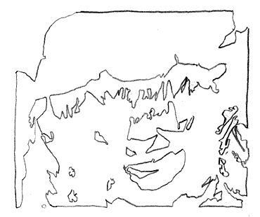
One at a time. Here's the starting picture - all the shadow shapes have been "recorded" as contours:
Distilling out just the shadow shapes
Your first picture, picture one - do single single hatching. Draw them all in one direction like you see in this picture. You don't have to use such a finely tipped pen like I did, and you don't have to make a zillion different lines like I did. You could also draw your hatches in a horizontal direction, or diagonally starting from the top left, going to lower right. (I'm left-handed, so moving in this direction, top right to bottom left, is easier for me.) (to top)
Picture 1
You might use a marker that would cover the same surface area five lines and five spaces cover in these pictures. (Notice I mentioned "spaces" too.) Just practice getting the feel for making lots of parallel lines - this is great "wrist" practice.
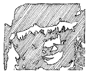
Picture 1: single direction hatches
Picture 2
In your second picture, start from scratch. (If you're using tiny hatches with a super fine point pen you're excused - you can just start adding the second layer. You're getting lots of practice.) In this picture I added the second diagonal layer:
Picture 2: adding a second layer of hatches
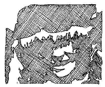
Picture 3
Then add the third layer. Start from scratch if you're working with a thick pencil line or a fat marker - the quality of your cross-hatching is directly dependant on the quantity of your practice. In this layer I added the vertical hatches:
Picture 3: the third layer
Picture 4
And lastly, add the fourth layer- the final horizontal set of hatches in this sketch:
Picture 4: adding a fourth and final layer of hatches
Do you have to stop after four layers? No. It's what fits the picture and what fits your style that matters. Of course "style" will come about on it's own after you've done enough practicing. :-)
Some other cross-hatching examples
Take a look at the following examples of cross-hatching. All these clips were taken from pictures that are in the archives - so you could hunt them down if you wanted to see the "bigger picture".
(to top)
(back
to end of doodle practice II above)
 |
 |
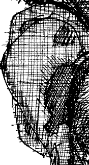
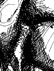
Notice the increased density of cross-hatching in the darkest areas. Note also the "hook" at the end of some of the strokes. (to top)
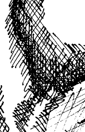
Notice how the light area along the lower middle right border suggests a curved surface? How's this accomplished? Look at the area of pure black first. Move to the right and you come across multi-layered cross- hatching next. The brightest area is all white - with a few long thin lines coursing over the surface. The same pattern occurs just above this shape. |
|
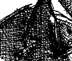
This last little example of cross-hatching is from a jacket lapel. The extremely straight lines suggest a flat surface more so than even mildly curved lines. I guess that only figures. Compare this with with the picture just above.
A very flat hatched surface |
About the next - and last -section
So there you have it - a primer on cross-hatching and it's place in the art world. In the last section, you're going to look at a treatment of light and highlight. This lesson pretty much ties together everything you've learned so far in all the lessons. You'll find recognizing highlights is really the same as recognizing shadows, except you're recognizing shapes made out of light - not shadow.
Don't skip over this section because
there's a really fun technique you're going to use too.
I'll tip my hand a little: you get to draw with an
eraser. You saw upside-down drawing in an earlier lesson.
In this final foundation lesson, you're going to learn
about a version of "inside-out" drawing. I'll
see you there!
(to top)
For further study
Two books by
non-caricaturists I highly recommend, (both link to
Amazon.com):
1) If you'd like to pursue cross-hatching farther, Gary Simmons has written a great book that's built entirely around line and cross-hatched drawings. It's called "The Technical Pen". Published by Watson-Guptill.
2) Another artist who uses lines like a genius is Paul Galle. His specialty: the pencil and his book appropriately titled "The Pencil" is filled with impressive techniques and and dynamic examples of his work. He really makes pencil drawings come alive.
Kasbohm & Company's
YouCanDraw.com
© Copyright, All rights reserved 1997
e-mail: jeffkaz@YouCanDraw